My concentration is home. The projects will portray the feeling of home by reflecting on family traditions and objects that I associate with home or people I love. The color scheme which I have chosen is a natural color palette, which I will work with to give a soft and comfortable feeling to my pieces. I plan on incorporating wood to symbolize my family's dining table, a place the people I love gather.
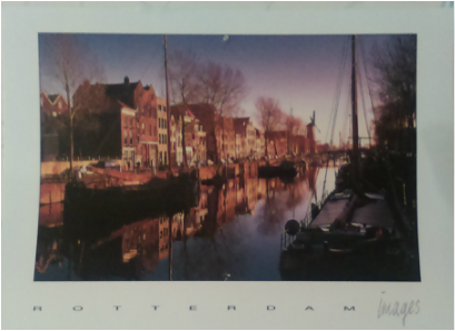
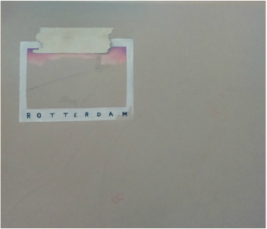
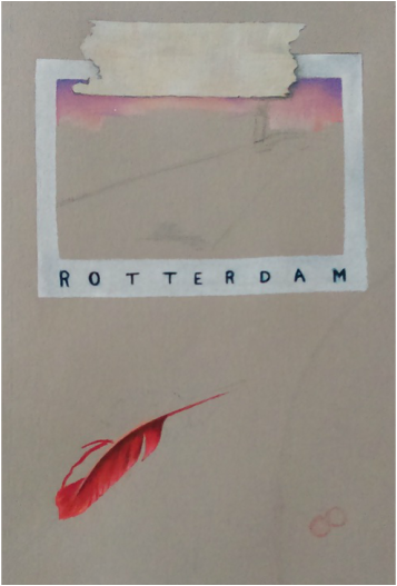
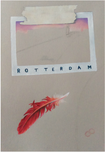
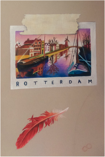
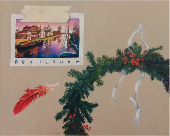
For my first project, I chose to base the idea from some objects in my bedroom. I placed a postcard that my friend gave me from the Netherlands, a wreath I made for my family for Christmas, the key to our front door, and a cardinal feather which represents North Carolina. I keep a feel of simplicity and give it a natural composition.
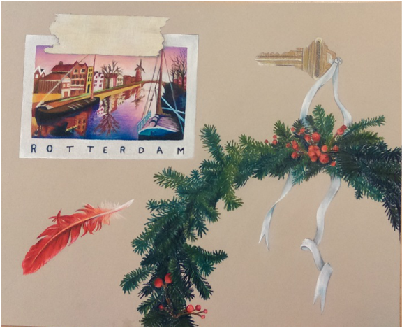
For my first project, I chose to base the idea from some objects in my bedroom. I placed a postcard that my friend gave me from the Netherlands, a wreath I made for my family for Christmas, the key to our front door, and a cardinal feather which represents North Carolina. I keep a feel of simplicity and give it a natural composition.
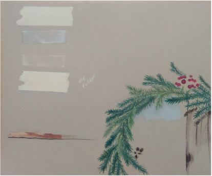
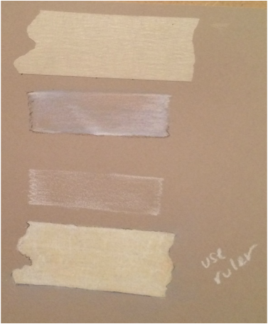
In the photos above I practice drawing pine, wood, and tape. The first strip of tape is real, which I stuck to my gray drawing paper, and tried my best to recreate it as realistic as I could. From memory, I drew the clear tape practicing and getting a feel for the white color pencil and its texture again before attempting the last tape strip.
By first making scratchy lines with the white pencil, I then colored over with the cream pencil to give it depth and texture.
From my rough draft, I liked how the light blue looked with the pine and I wanted to incorporate it in my piece. The light blue, dark brown, and pine looked calm together. To add a hint of light blue, I had the idea of putting a light blue ribbon through the key. This brings me back to the first piece I did in Art4, of the ballerina in a snowglobe.
 RSS Feed
