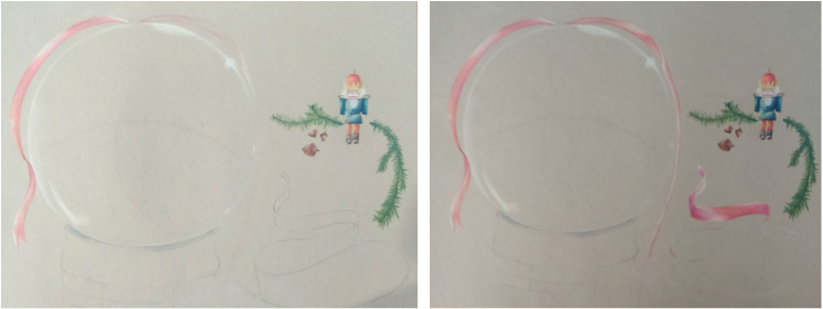
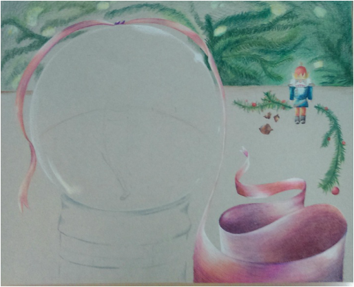
Here are pictures of my process step-by-step!
 |  |
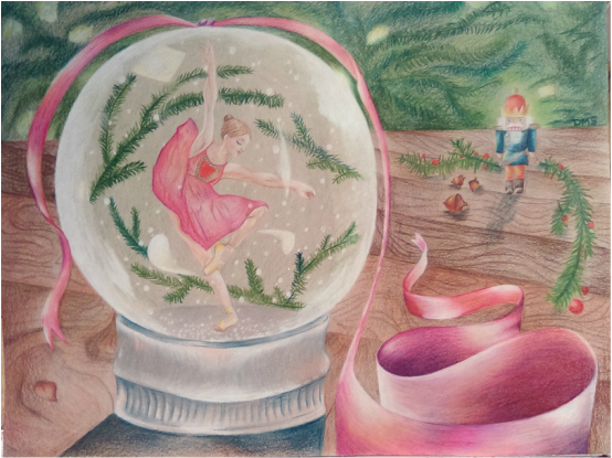
This is my first project done completely of prismacolors! At first, I found it very challenging, but I felt more comfortable with this medium at the end, as I saw it all coming together.
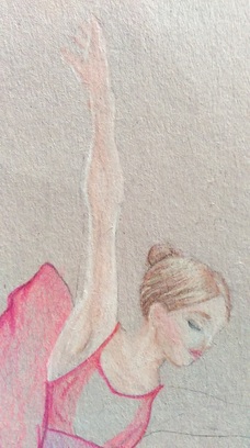
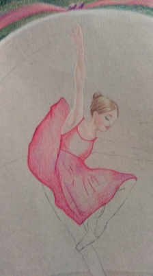
My purpose for this piece was reflecting a treasured memory. For my seventeenth birthday, my mom surprised me with tickets to see " The Nutcracker". Watching the performance was incredibly inspirational, seeing the dedication, passion, and hard work that goes into ballet. I feel that this memory reflects how passionate I am about art.
The most difficult part of this project was understanding how to work with prismacolors. The colors that I found most useful were white, and ochre. They created the lighting, and the helped achieve the natural color scheme I aimed for.
Picking the appropriate paper, was a lesson learned. The paper I chose would flake as I colored, and caused the piece to have a fuzzed look. Picking a sturdy, smooth paper would have given a sharper, clean-cut look.
The fun part of the project was using the different colored prismas and blending them together, to enhance the coloring. For example, the ribbon is pink, purple, and dark blues. This helped to make the shadows not too dark, but also bring color to the picture. I incorporated pinks on the silver part of the snow globe to show the colors reflecting from the ribbon. I did the same with the nutcracker, putting in greens on one side, to reflect the colors from the pine tree branches in front of the nutcracker.
While my project had a slow start, I learned so much from this project. I will take what I have learned, and try a second attempt with prismas!
 RSS Feed
