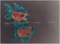
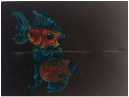
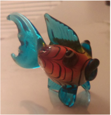
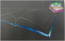
   Beginning this project I felt it would be the most challenging, because of the color, and reflections of light. As I continued to work on the piece I started to have a better understanding of the object. I focused on the color, and drew what I saw. I liked incorporating all the different colors, and emphasizing them with complementarities. The body is red-orange, and the tail is blue. So I put cool colors on the blue parts to emphasize the blue hues, and warm colors such as yellow to emphasize the orange. | 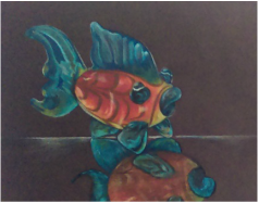 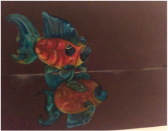 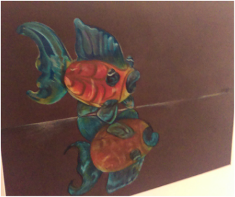 By emphasizing these colors, I could make the tail, and fins, really complement the red body. I then drew a faded white line to make it look like a glass table. Then I put in the distorted dark shadow. I noticed I worked faster with prismacolors in this piece. I am comfortable with this medium now. I learned in this project how colors really play a major part when working with prismas. |
|
0 Comments
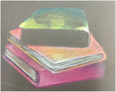
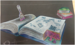
Using prismacolors I am creating a piece that represents different elements of math. I am placing a compass in the front left, math textbook in the middle, and stack of textbooks in the background. The twist is that a slice of the textbook is cut out revealing a pie inside. I drew a pie to make a pun from the pi used in math. Here is my progress so far:
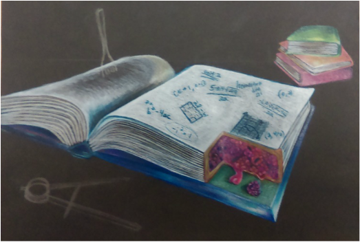 This project was not easy at all. I worked over the snow days, but I still had so much to do. Over the break I finished the pie, but the background was still blank. It took me about two days to finish the background, but the compass and adding detail to the wood table took a whole class time. I thought of this project the week where I was frustrated in my math class. I felt completely lost. I did not understand, even if the teacher told me step-by-step. Math has always been a challenge for me. I did this project to express that it is not has hard as I make it. I make math an obstacle for myself by panicking and thinking negatively. Here is my final project: 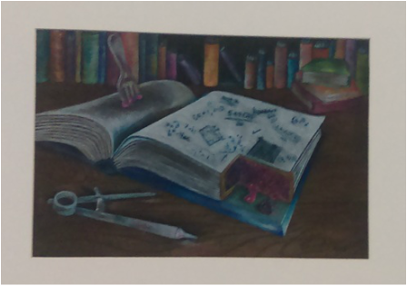 Here are pictures of my process step-by-step! 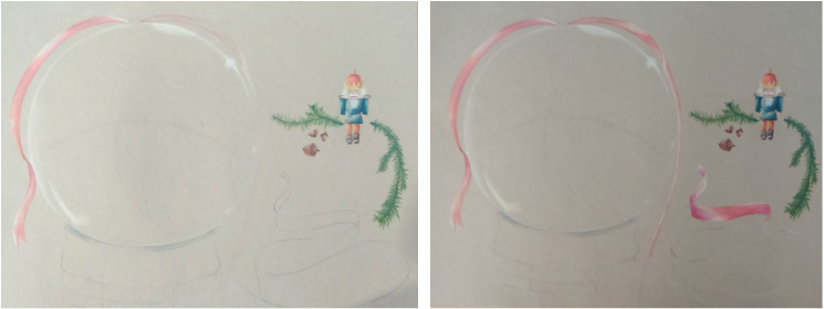 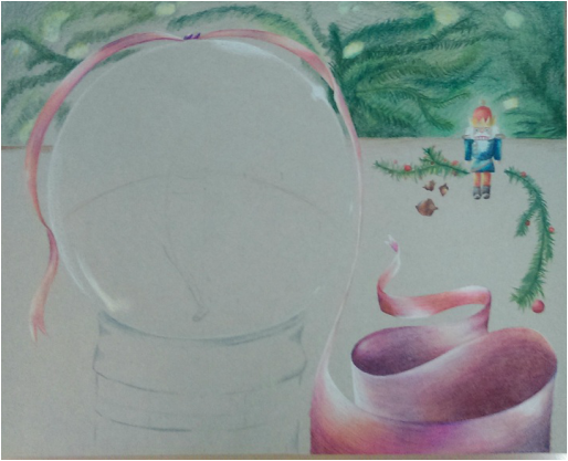
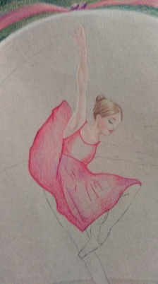
 This is my first project done completely of prismacolors! At first, I found it very challenging, but I felt more comfortable with this medium at the end, as I saw it all coming together.
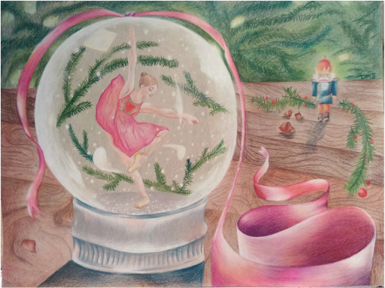
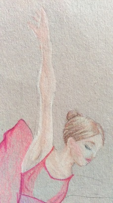
My purpose for this piece was reflecting a treasured memory. For my seventeenth birthday, my mom surprised me with tickets to see " The Nutcracker". Watching the performance was incredibly inspirational, seeing the dedication, passion, and hard work that goes into ballet. I feel that this memory reflects how passionate I am about art. The most difficult part of this project was understanding how to work with prismacolors. The colors that I found most useful were white, and ochre. They created the lighting, and the helped achieve the natural color scheme I aimed for. Picking the appropriate paper, was a lesson learned. The paper I chose would flake as I colored, and caused the piece to have a fuzzed look. Picking a sturdy, smooth paper would have given a sharper, clean-cut look. The fun part of the project was using the different colored prismas and blending them together, to enhance the coloring. For example, the ribbon is pink, purple, and dark blues. This helped to make the shadows not too dark, but also bring color to the picture. I incorporated pinks on the silver part of the snow globe to show the colors reflecting from the ribbon. I did the same with the nutcracker, putting in greens on one side, to reflect the colors from the pine tree branches in front of the nutcracker. While my project had a slow start, I learned so much from this project. I will take what I have learned, and try a second attempt with prismas! |
 RSS Feed
