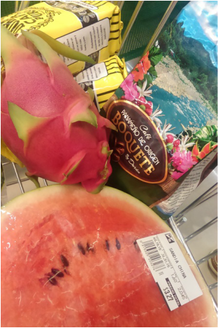
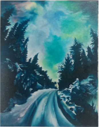
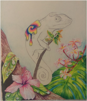
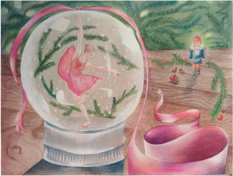
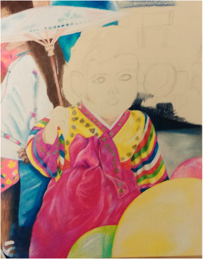
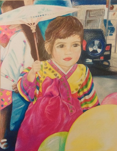
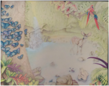
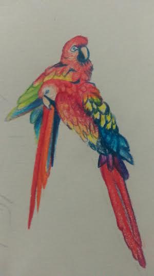
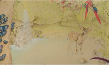
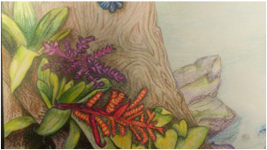
For this project I wanted to think outside the box. In my last project I did everyday objects inside a grocery cart, so I chose to branch out from just drawing more objects. My idea for this theme is an image inside an image.
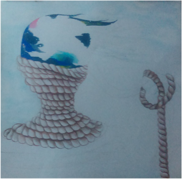
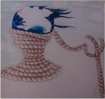
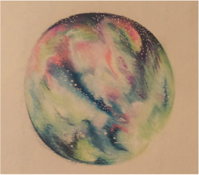
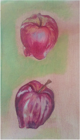
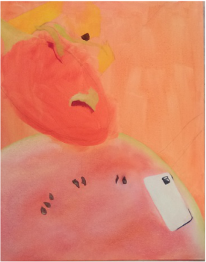
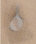
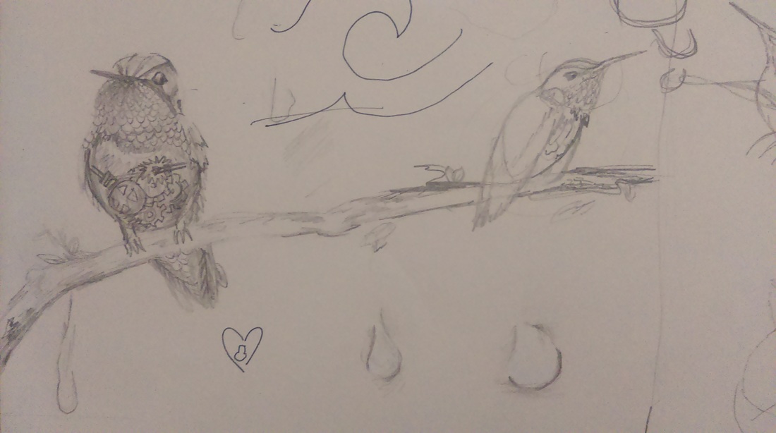
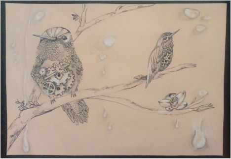
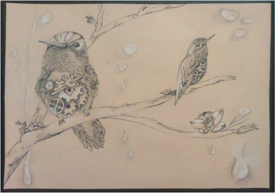
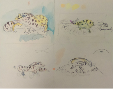
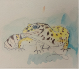
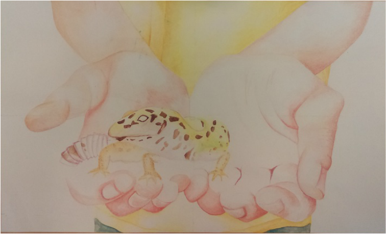
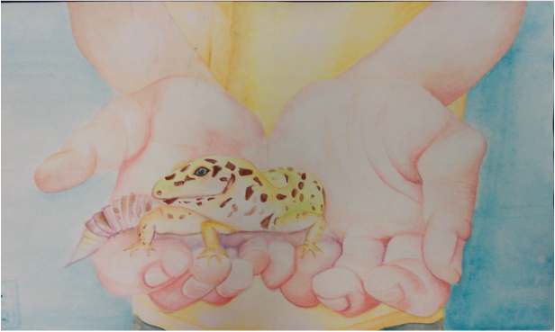
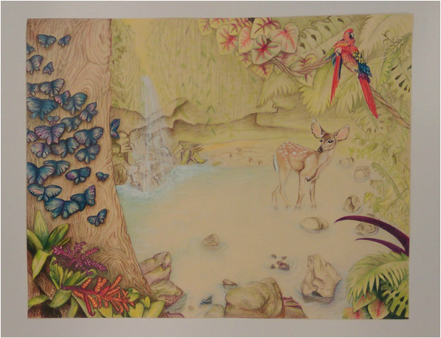
After sketching out my idea, I wanted to focus on blending color and a color scheme. I love how prisma can creative realistic yet cartoon like styles. This is what I experimented with before starting my project:
After sketching out my idea, I wanted to focus on blending color and a color scheme. I love how prisma can creative realistic yet cartoon like styles. This is what I experimented with before starting my project:
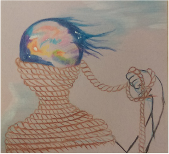
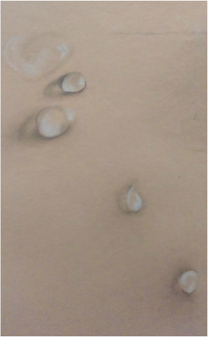
As I further developed my idea, and ask for input from my table, I wanted to make sure the arm did not look like it was separate from the person's silhouette. It seemed like the arm was a separate subject. Although, when I then started my project it became difficult to visually understand how the rope would fall transitioning from the body to the arm. This issue took too long to think about so I omitted it. I tried to bring the focus back to the colors and texture of the rope, to help tie in the arm and body.
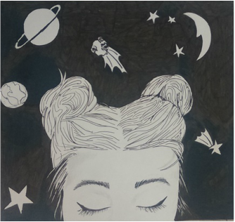
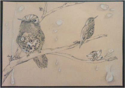
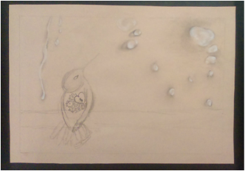
This has been the most challenging project so far, because I did not have a picture to go off of. I became indecisive and hesitant to start my project, because the only solid plan was in my mind. When I sketched this, it had a different look than I imagined. It was more cartoonish on paper. I went with this style and tried to make it work. It reminds me of a character than could have been on "Courage the Cowardly Dog", a show I watched as a kid. I thought of this sketch with just my imagination and photo references of rope, clouds, and outer space.
I am leaving this piece untitled for now. These are my ideas for the title:
1) Spaced Out II
2) Personal Space
3) Cosmic Thoughts
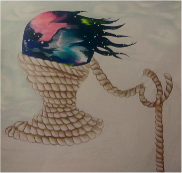
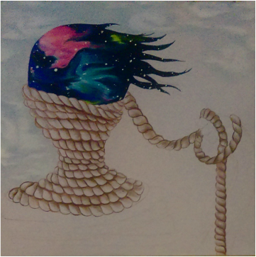
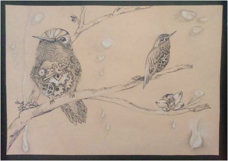
I chose a light lavender paper to go with this color scheme to enhance the browns and give some color to the sky and cloud background.
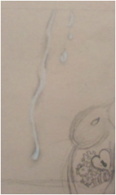
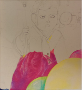
I also continued working with fantasia color pencil, dusty and airy textured pencils, and mixing them with prismas, which have a waxy texture and gloss. When I went to Jerry's Artarama over the summer, I was talking to one of the employees about color pencils. He showed me the different types and introduced to me the various textures and finishes color pencils have. He also said that he usually sticks to one brand per project and doesn't mix them because their textures don't match. Over the summer and in this project I have been trying to find a way to mix the different color pencils. I find that when mixed it gives a different feel. The waxy prismas help enhance certain areas, while fantasia pencils do the opposite.
In this piece I also used white gel pen to get white highlights for the stars.
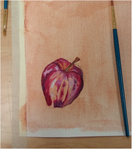
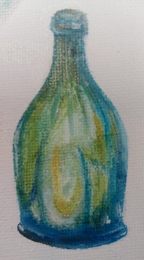
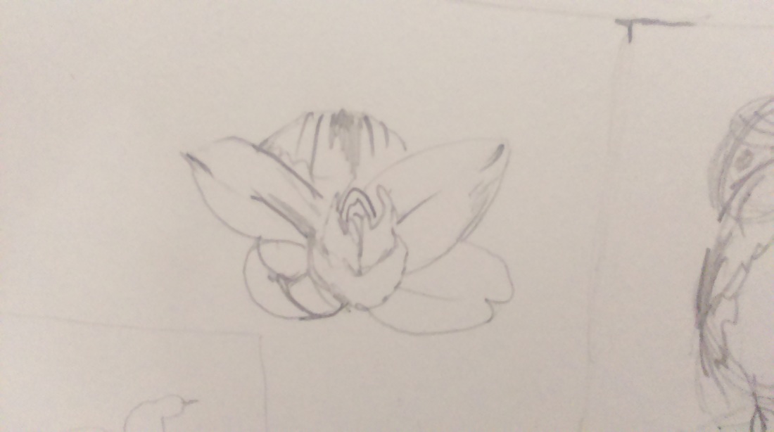
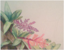
Here is an example of me blending prismas with fantasia pencils over the summer:
I also continued working with fantasia color pencil, dusty and airy textured pencils, and mixing them with prismas, which have a waxy texture and gloss. When I went to Jerry's Artarama over the summer, I was talking to one of the employees about color pencils. He showed me the different types and introduced to me the various textures and finishes color pencils have. He also said that he usually sticks to one brand per project and doesn't mix them because their textures don't match. Over the summer and in this project I have been trying to find a way to mix the different color pencils. I find that when mixed it gives a different feel. The waxy prismas help enhance certain areas, while fantasia pencils do the opposite.
In this piece I also used white gel pen to get white highlights for the stars.
Here is an example of me blending prismas with fantasia pencils over the summer:
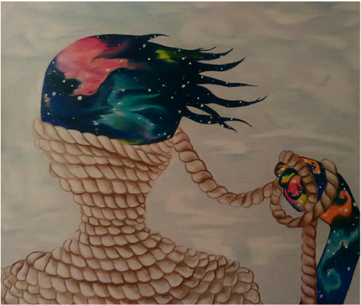
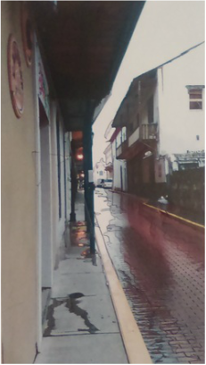
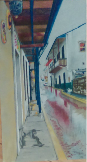
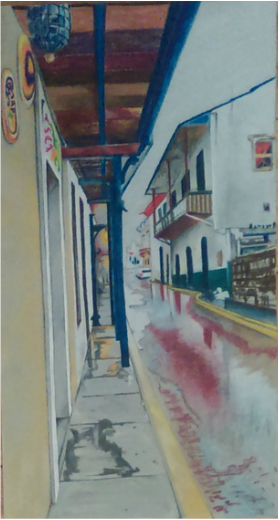
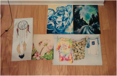
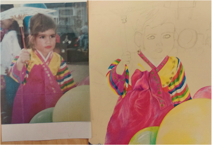
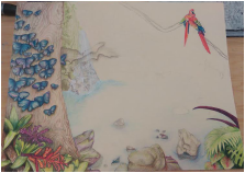
My final project:

 RSS Feed
